Here's what I learned:
1. Color in circles, not straight lines.
2. The color should saturate the paper so when you turn it over, it looks like it bled through. Use a few sheets of scrap paper under to protect your surface.
3. The main purpose of the Copics is for creating shading and light and dark spaces. You can use two or three colrs in the same family to create shadows and shading.
4. The blender is NOT a blender. It actually acts like a bleach, taking out color instead of blending together two colors.
5. The best ink to use to stamp your image in Memento ink. Not only was this the one recommended in the class but also on SCS. You should also use a very "tight" paper. PTI is the one recommended on SCS. I tried to use my CTMH ink but - well- you'll see. Do NOT use Staz-On or Archival ink, they will bleed and run.
I'm sure there was more but then I had fun practicing my shading with this cute little mouse. We made this project last night. It's actually a 4X4 small box, perfect for putting in gift cards for teachers- hmmm- a class maybe????

I think he came out pretty cute. We used the warm grays to color and shade and actually used pink for the ears and feet and then colored over the pink with the lightest gray to achieve that soft look.
So, then I came home and thought I would try it out with some flowers. However, I didn't realize that there really IS a difference in the inks and this is what happened with CTMH black ink-

The pink one came out OK but the blue one ran and the orange started to run when I played with it too long. So you know where I'm going today right? To buy the Memento ink and play some more!!
Thanks for looking everyone- as of this post I am up to 999 views!!! Hopefully I'll make 1,000 today!!
Jean:)

 Here is the layout I came up with:
 Here they are side by side:
 Remember, your layout doesn't have to be the same as the picture, it is really just a starting point. I liked this picture because I liked the color blocking. You can always change the color scheme or the layout to make it your own!
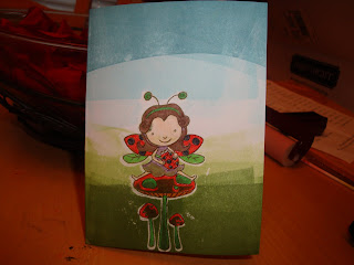 AHHH! What happened to this? Well, I didn't realize that I had to Versamark the entire image and heat embooss, so some of the ink from the brayer seeped into the image itself. It just didn't go well!
 So, I think the second one is better than the first but I still need to work on choosing the colors and blending them better. Any suggestions or comments would be more than welcome!

 And a little bit o' news- I had my big variance meeting last night for the extension we are putting on for my in-laws and much to our relief- everything was approved!!!!! We are so grateful and can finally get ready to start having all the construction begin.


